Syntax for Forms public beta
When you create a browser source extension, you can define a form that allows users to customize the extension. This form is defined using YAML syntax and can contain various types of inputs, such as text fields, dropdowns, color pickers, and more. You define these inputs in a dedicated forms.yaml file. The OWN3D CLI picks this up during deployment together with your manifest.yaml. To learn more about the manifest file, check out the Manifest Configuration documentation.
What Are Forms?
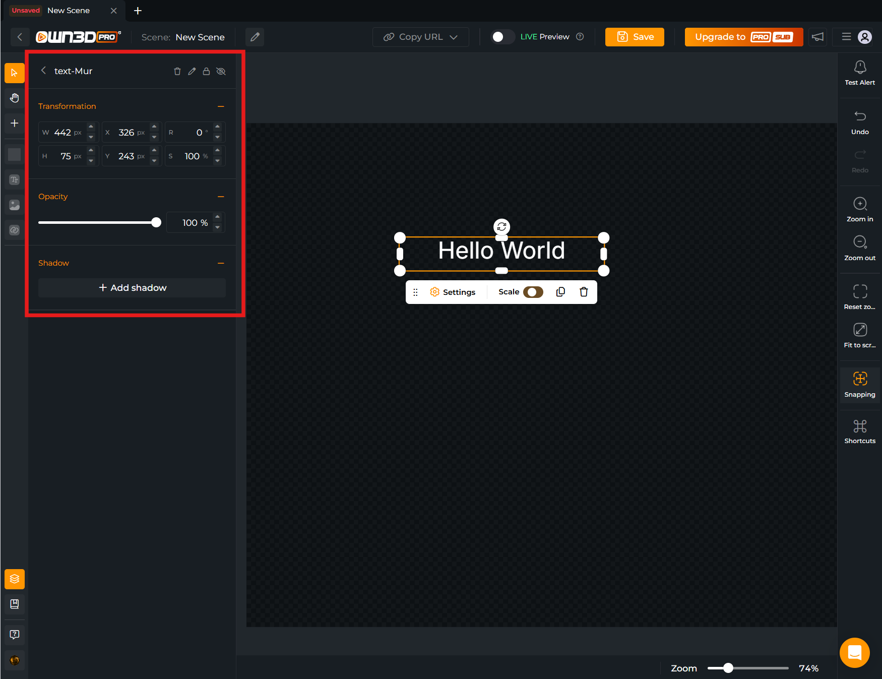
Forms are the structured, declarative way for an extension (primarily a browser-source / widget) to expose user‑configurable settings inside the Scene Builder. When a creator selects your widget instance in a scene, the Scene Builder shows a Settings tab. This tab merges:
- Native Inputs (built‑in properties every source may have, like Transform or Opacity) and
- Your Custom Form Inputs (declared in
forms.yaml)
Together they let streamers tailor appearance, behavior, data sources, sounds, animations, filtering logic, and other runtime characteristics without editing code.
Key characteristics:
- Location & Visibility: Displayed in the Scene Builder "Settings" panel for each placed instance of your extension.
- Scope: Values are stored per scene item / extension instance (so two instances can have different settings) unless a field itself aggregates or references shared resources (e.g. uploaded files).
- Definition Source: Declared in a top‑level
forms.yamlfile sitting next to yourmanifest.yaml(legacy: inline undercompatibilities.browser-source.forms). The file containsschema_version,id, andinputs. - Complement, Not Replace: They sit alongside native inputs (Title, Transform, Shadow, Filters, Opacity). Your form should only declare what is unique to your widget.
- Live Propagation: When a user changes a value, it is automatically persisted and propagated to the running extension instance. Your code receives updated values through the extension context (see Receiving Values / Extension SDK section). No manual polling is required.
- Typed & Validated: Field types (slider, color, dropdown, etc.) enforce structure, provide consistent UI, and reduce validation work in your runtime code. Conditional logic can progressively disclose advanced options.
- Versioning & Evolution:
schema_versionallows future evolution of the form schema. Changing or removing field IDs can cause existing saved values to be dropped for that field; plan migrations carefully to preserve streamer setups. - Performance Considerations: Extremely large or deeply nested forms, or heavy conditional logic, can slow initial load of the Settings tab. Prefer concise, grouped sections and only add conditional expressions where they add real value.
Typical use cases:
- Styling / Theme: Colors, gradients, font settings, border radius, spacing.
- Content & Assets: Text strings, uploaded images / sounds, selecting alert sets, choosing platform events.
- Behavior Toggles: Feature enable/disable, filtering options, timeouts, demo/test mode.
- Dynamic Collections: Repeaters for custom lists (e.g. rotating messages, multiple layout entries).
How forms relate to runtime code:
- During deployment, the manifest (including the form definition) is validated by OWN3D.
- At runtime, the platform constructs a
valuesobject keyed by each inputidand injects it into the extension context. Use the modular Extension SDKuseContext(extension).onContext(...)to react to initial load and incremental changes (the legacyOWN3D.ext.onContextnamespaced API is deprecated and not shown in examples below). - Some specialized fields (e.g.
file,platforms,platform-event) enrich values with structured objects or arrays that can directly drive logic in your widget.
If you do not define a form, only native inputs will appear. Adding even a minimal form significantly enhances customizability and makes your widget feel first‑class to creators.
In short: A form is the contract between your extension's configurable surface and the Scene Builder UI—describe it once in YAML, and OWN3D handles rendering, persistence, validation, and value delivery to your code.
Migration (Inline -> forms.yaml)
If you previously defined forms inline inside manifest.yaml (under compatibilities.browser-source.forms), migrate by:
- Creating a new
forms.yamlfile in your extension root. - Moving the form keys (
schema_version,id,inputs, plus any supported top‑level form flags) into that file. - Removing the old inline
forms:block frommanifest.yaml. - Verifying the
idinforms.yamlstill matches the extensionidinmanifest.yaml. - Redeploy with the CLI.
No value changes occur; persisted user settings map by field id and remain intact as long as those IDs do not change.
About YAML Syntax
YAML is a human-readable data-serialization language. It is commonly used for configuration files and in applications where data is being stored or transmitted. YAML targets many of the same communications applications as Extensible Markup Language (XML). YAML is a superset of JSON, and YAML files can be parsed as JSON.
Native Inputs
Native inputs are inputs that are already available in the browser source. They are not defined in the form file. These are the native inputs:
- Title
- Transform
- Shadow
- Filters (only available for images and videos)
- Opacity
Creating Forms For Extensions
In opposite to native inputs, custom inputs are defined in the form file. These allow you to create custom inputs for your extension. Even our internal widgets are using this system. The following example shows how to create a form for a browser source:
Creating forms for browser sources is very easy. We use YAML syntax to define the inputs. The following example shows the syntax for a form with different input types:
Each form must contain a schema version (
schema_version) and an uuid (id) and an array of inputs (inputs). The uuid is used to identify the form in the scene editor which must match with your extension id. The inputs array contains all the inputs that are available in the form.
schema_version: 1
id: 98f9fab0-0714-46d8-ac77-d57130a1dc88
inputs:
  - type: input
    id: text
    attributes:
      label: Text
      description: This is a description
      value: Hello World
Limitations
- The
idof the form must match theidof the extension. - The
idof the inputs must be unique and cannot beextension. - The
idof the inputs must be an alphanumeric string with a length of 3-32 characters and may contain dashes and underscores.
Fields
Boolean Field

The boolean field may be used to represent a boolean / on/off value. The resulting values will be represented as a boolean value.
  - type: boolean
    id: random
    attributes:
      label: Random
      description: This is a description
      value: true
Resulting values:
{
  "random": true
}
Border Radius Field
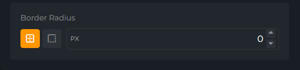
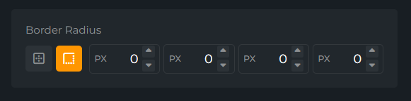
The border-radius field provides a beautiful input that can be used to select a border radius value. The value is required and must be an object with the following properties: multiple, radius, top-left, top-right, bottom-left & bottom-right. multiple will allow you to set the border radius for each corner individually. The radius value will be used when multiple is set to false.
  - type: border-radius
    id: border-radius
    attributes:
      label: Border Radius
      value:
        multiple: false
        radius: 0
        top-left: 0
        top-right: 0
        bottom-left: 0
        bottom-right: 0
Resulting values:
{
  "border-radius": {
    "multiple": false,
    "radius": 0,
    "top-left": 0,
    "top-right": 0,
    "bottom-left": 0,
    "bottom-right": 0
  }
}
Button Field
The button field allows you to create a button that can be used to trigger an action. It will emit an event through the extension IPC module when the button is clicked. There is no value for this field.
  - type: button
    id: button
    attributes:
      label: Click Me
Emitted event:
import { useSceneBuilder } from '@own3d/sdk/scene-builder'

const { onClick } = useSceneBuilder(/* extension instance */)

onClick('foo', () => {
  console.log('clicked foo')
})
Checkbox Field
Warning
Migration Required: The checkbox field has been updated to return an array of selected values. Previously, it returned an object with the selected value as the key and a boolean as the value.
Please update your code to handle the new format as shown in the example below.
Use version: 2 in the field to enable the new format. The new format will be enabled by default in the future. To stay compatible with the old format, use version: 1.
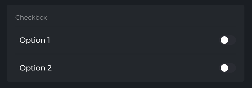
The checkbox field may be used to represent a boolean / on/offvalue. The resulting values will be represented as an array of selected values.
  - type: checkbox
    id: checkbox
    version: 2
    attributes:
      label: Checkbox
      description: This is a description
    options:
      - label: Option 1
        value: option-1
        checked: true
        required: true
      - label: Option 2
        value: option-2
        checked: false
        required: false
Resulting values:
{
  "checkbox": [
    "option-1"
  ]
}
Resulting legacy values:
// version: 1
{
  "checkbox": {
    "option-1": true,
    "option-2": false
  }
}
Chips Field
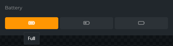
The chips field provides a set of chips that can be selected. It behaves exactly like a dropdown field, but with a different UI.
  - type: chips
    id: battery
    attributes:
      label: Battery
      value: full
    options:
      - label: Full
        value: full
        icon: battery-full
      - label: Half
        value: half
        icon: battery-half
      - label: Empty
        value: empty
        icon: battery-empty
Resulting values:
{
  "battery": "full"
}
Color Field
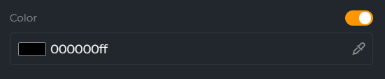
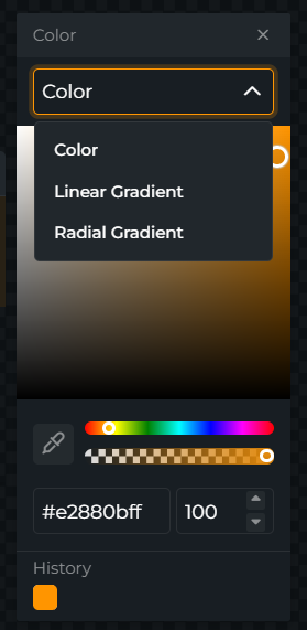
The color field provides a color picker that can be used to select a color. The hex code can be either 6 or 8 characters long. The 8 character hex code will be used for the alpha channel.
If allow-gradient is set, the user can choose between color, linear gradient and radial gradient.
  - type: color
    id: color
    attributes:
      label: Color
      allow-gradient: true
      value: "#ff0000"
Resulting values for hex-color:
{
  "color": "#ff0000"
}
Resulting values for linear-gradient
{
  "color": "linear-gradient(90deg, #FF9602 0%, #ffffff 100%)"
}
Resulting values for radial-gradient
{
  "color": "radial-gradient(circle, #c99144ff 0%, #ffffff 100%)"
}
DatetimePicker Field
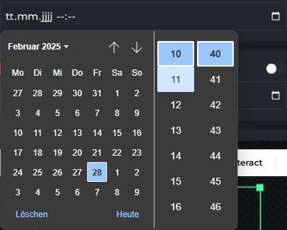
The datetimePicker field provides a date and time picker.
  - id: datetimepicker
    type: input
    exclude_from_template: true
    attributes:
      type: datetime-local
      label: 'DateTime Picker'
      value:
        value: ''
        toggled: false
Dropdown Field
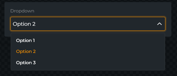
The dropdown field provides a dropdown menu. The select options may be defined in the options array.
  - type: dropdown
    id: dropdown
    attributes:
      label: Dropdown
      value: 2
    options:
      - label: Option 1
        value: 1
      - label: Option 2
        value: 2
      - label: Option 3
        value: 3
Resulting values:
{
  "dropdown": 2
}
File Field
Warning
The file field UI will be updated soon.
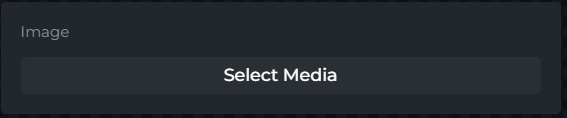
The file field allows you to upload a file. The mimeTypes array is required and must contain a list of mime types which are allowed to be uploaded but limited to the following types: mp3, mp4, webm, wav, png, jpg, jpeg and gif. The max file size is 5MB by default.
Multiple files can be uploaded by setting the multiple attribute to true. When multiple is set to true, the value will be an array of file ids & types.
We offer multiple popups for selecting files. The popup attribute can be used to define which popup should be used. If you don't define a popup, the default popup files will be used. The following popups are available:
files- Allows you to select files from your OWN3D media librarygifs- Allows you to select GIFs from Tenor
  - type: file
    id: image
    attributes:
      label: Image
      multiple: false
      mimeTypes:
        - image/*
Resulting values:
{
  "image": {
    "id": "1337",
    "type": "file"
  }
}
How Files Are Stored
When a file is uploaded using this field, OWN3D will store the file for you. The file will be stored in the OWN3D CDN and will be available until the file is deleted. The value of the field will be the file id which can be used to retrieve the file using the File Storage API.
Font Settings Field
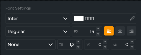
The font-settings field provides a multi input field for font settings. It provides a list of fonts that are available in Bunny Fonts (the font provider for OWN3D and equivalent to Google Fonts).
  - type: font-settings
    id: font-settings
    attributes:
      label: Font Settings
      value:
        font-color: "#ffffff"
        font-family: Inter
        font-weight: 400
        font-size: 14
        text-align: left
        font-style: normal
        letter-spacing: 0
        line-height: 1.2
        text-indent: 0
Resulting values:
{
  "font-settings": {
    "font-color": "#ffffff",
    "font-family": "Inter",
    "font-weight": 400,
    "font-size": 14,
    "text-align": "left",
    "font-style": "normal",
    "letter-spacing": "normal",
    "line-height": 1.2
  }
}
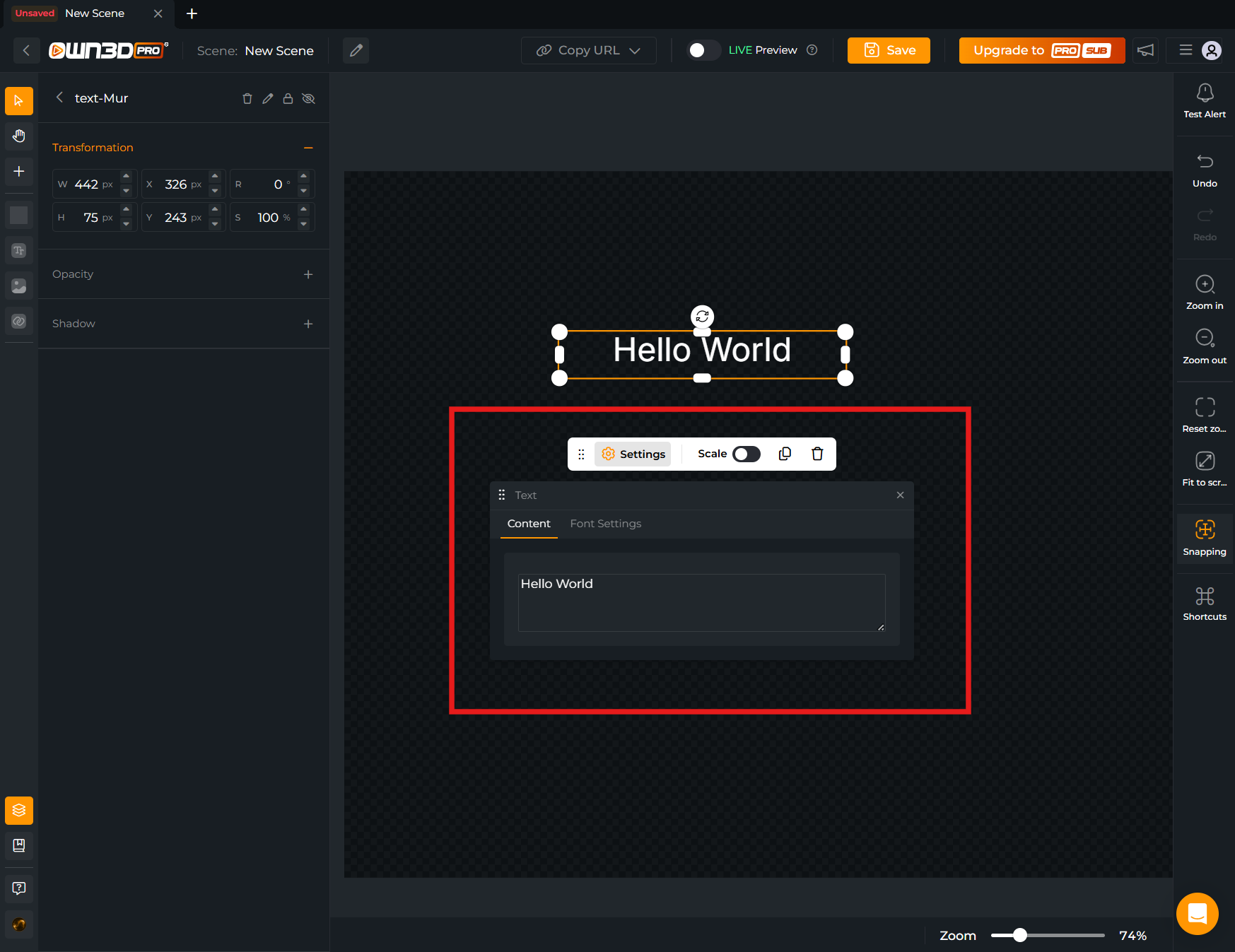
Input Field
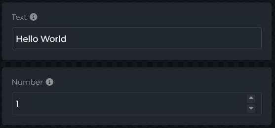
The input field provides a simple text input. The attributes.type attribute can be used to define the type of input (text , number). The attributes.type attribute is optional and defaults to text.
  - type: input
    id: text
    attributes:
      description: This is a description
      label: Text
      optional: false
      type: text
      value: Hello World
Resulting values:
{
  "text": "Hello World"
}
If optional: true is set, the value will be an object with a toggled and value property.
  - type: input
    id: text
    attributes:
      description: This is a description
      label: Text
      optional: true
      type: text
      value:
        toggled: true
        value: Hello World
Resulting values:
{
  "text": {
    "toggled": true | false,
    "value": "Hello World"
  }
}
Number Field
To create a number field, use type: input and set attributes.type: number.
Example:
- type: input
  id: borderRadius
  attributes:
    label: Border Radius
    description: Border radius for quiz answers (px)
    type: number
    value: 12
    min: 4
    max: 36
Link Field

The link field allows you to create a link that can be used to navigate to a specific URL. It will open the link in a new tab. There is no value for this field.
The type attribute can be used to define the type of link (button or text). The type attribute is optional and defaults to text.
  - type: link
    id: link
    attributes:
      label: Link
      value: https://example.com
      type: text # optional
Paragraph Field
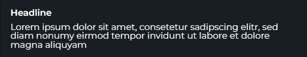
The paragraph field allows you to display a paragraph of text. The headline is optional. There is no value for this field.
  - type: paragraph
    id: paragraph
    attributes:
      headline: Headline
      content: Lorem ipsum dolor sit amet, consetetur sadipscing elitr…
Platforms Field
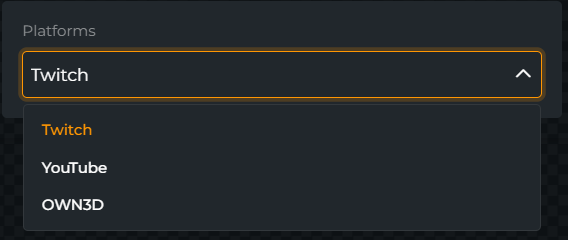
The platforms fields allows you to select a single or multiple streaming platform connection. It will automatically fetch the available platforms from the Connections API and pass them to the extension context. The value will be an array of selected platforms. options can be omitted. The selectable values will be the intersection of options (if given) and the platforms that are connected to the user account, including the "own3d" platform.
  - type: platforms
    id: connections
    options:
      - value: twitch
      - value: youtube
      - value: own3d
    attributes:
      label: Platforms
      multiple: false
Resulting values:
{
  "platforms": [
    "twitch",
    "youtube"
  ]
}
{
  "context": {
    "connections": [
      {
        "platform": "twitch",
        "channel_id": "1337"
      },
      {
        "platform": "youtube",
        "channel_id": "1337"
      }
    ]
  }
}
Platform-Event Field
With multiple: false you can select a single event. 
With multiple: true you can select multiple events. 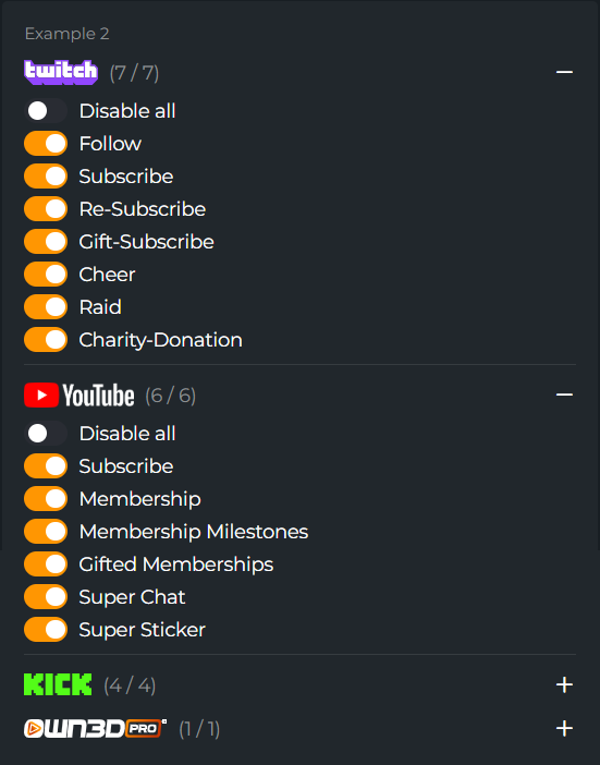
The platform-event field allows you to select a single event or multiple events by platform. It will automatically show the available platforms and events supported by us. The value will be an array of selected platforms and events. options can be omitted. The selectable values will be the intersection of options (if given), the connected platforms of the user and the platforms and events that are supported by us.
- id: example-1
  type: platform-event
  options: # optional
    - platform: twitch
      types:
        - follow
        - subscribe
        - re-subscribe
        - gift-subscribe
        - cheer
        - raid
        - charity-donation
  attributes:
    label: 'Example 1'
- id: example-2
  type: platform-event
  attributes:
    label: 'Example 2'
    multiple: true
Resulting values:
{
  "example-1": [
    {
      "platform": "twitch",
      "type": "follow"
    }
  ],
  "example-2": [
    {
      "platform": "twitch",
      "type": "follow"
    },
    {
      "platform": "twitch",
      "type": "re-subscribe"
    },
    {
      "platform": "youtube",
      "type": "superchat"
    }
  ]
}
Repeater Field
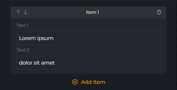
The repeater field allows you to repeat a set of fields. The fields array is required and must contain the fields that should be repeated.
The cta attribute can be used to define the label of the button that adds a new item. The label attribute can be used to define the label of the repeater.
- id: my-repeater
  type: repeater
  fields:
    - id: text-1
      type: input
      attributes:
        label: 'Text 1'
        value: 'Lorem ipsum'
    - id: text-2
      type: input
      attributes:
        label: 'Text 2'
        value: 'dolor sit amet'
  attributes:
    cta: 'Add Item'
    label: Item
Resulting values:
{
  "my-repeater": [
    {
      "text-1": "Lorem ipsum",
      "text-2": "dolor sit amet"
    },
    ...
  ]
}
Resource Field
Warning
The resource field is currently not supported in the scene editor.
Additional resource options may be defined in the options array, like in the dropdown field. When using the multiple option, the value will be an array of selected values.
  - type: resource
    id: alert-set
    attributes:
      label: Alert Set
      description: This is a description
      value: 1337
      multiple: false
      resource:
        resolver: fetch
        endpoint: /v1/alerts-sets
        map:
          label: $.data[*].name
          value: $.data[*].id
Resulting values:
{
  "alert-set": "1337"
}
Select Field
Warning
Limited Support: The select field currently only supports the grid style.
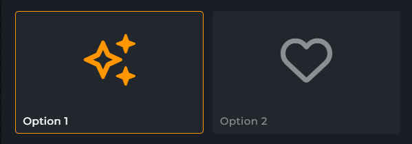
The select field provides different ways to represent a select menu. Options may be defined in the options array.
  - type: select
    id: my-select
    attributes:
      type: grid
      multiple: false | true
      value: [ option-1 ] # This is always an array
    options:
      - label: Option 1 with icon
        value: option-1
        icon: sparkles # Fontawesome Icon
      - label: Option 2 with image
        value: option-2
        image: images/option-2-thumbnail.png # Path to image in the extension
Resulting values:
{
  "my-select": [ "option-1" ]
}
Slider Field
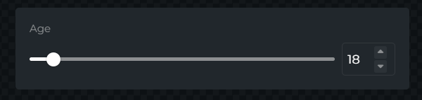
The slider field provides a beautiful slider that can be used to select a value. The min, max & step values are required.
  - type: slider
    id: age
    attributes:
      label: Age
      value: 18
      min: 13
      max: 99
      step: 1
Resulting values:
{
  "age": 18
}
Tags Field
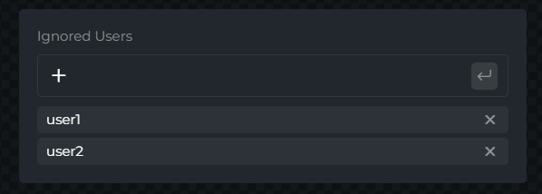
The tags field allow you to freely type in a list of words. This field is useful for adding a list of users, for which may be included or excluded from a feature, for example.
  - type: tags
    id: ignored-users
    attributes:
      label: Ignored Users
      description: The users that will be ignored
      value:
        - user1
        - user2
Resulting values:
{
  "ignored-users": [ "user1", "user2" ]
}
Volume Field
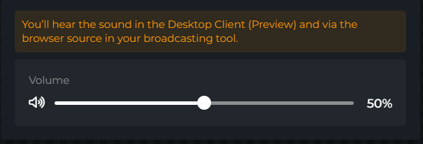
The volume field provides a beautiful slider that can be used to select a volume value. The value is required and must be a number between 0 and 1.
  - type: volume
    id: volume
    attributes:
      label: Volume
      value: 0.5
Resulting values:
{
  "volume": 0.5
}
Organizing Fields
Sometimes it is necessary to group fields together. This allows you to structure the form in a more appealing way and makes it easier for the user to understand the form. The following fields can be used to group fields:
| Field | Description |
|---|---|
| Accordion | A group of fields that can be collapsed and expanded. |
| Group | Visually combines other fields into a group. |
| Row | Visually combines other fields into a row. |
| Search | Makes it possible to search through fields and their ancestors. |
| Tabs | Provides a tab bar with defined tabs to structure and group other fields. |
Accordion Field
The accordion field can be used to group any number of other fields.
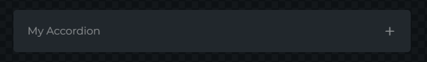
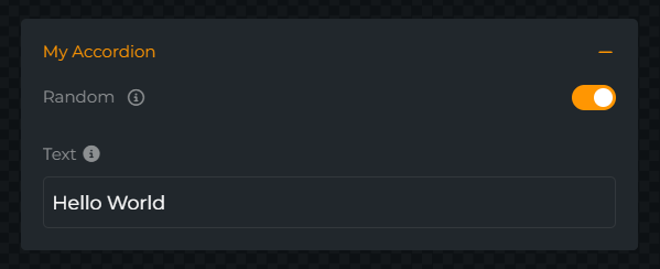
  - type: accordion
    id: my-accordion
    attributes:
      label: My Accordion
    fields:
      - type: boolean
        id: random
        attributes:
          label: Random
          description: This is a description
          value: true
      - type: input
        id: text
        attributes:
          label: Text
          description: This is a description
          value: Hello World
          type: text
      - ...
The field does not store any values.
Group Field
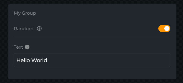
The group field can be used to visually combine other fields into a group.
  - type: group
    id: my-group
    attributes:
      label: My Group
    fields:
      - type: boolean
        id: random
        attributes:
          label: Random
          description: This is a description
          value: true
      - type: input
        id: text
        attributes:
          label: Text
          description: This is a description
          value: Hello World
          type: text
      - ...
The field does not store any values.
Row Field
Warning
Experimental: The row field may not work as expected in all cases.
The row field can be used to group other fields into a row. The colSpan attribute can be used to define the width of the field.
We recommend using not more than a total of 4 columns in a row.
Examples:
- Two fields with
colSpan: 1each will result in a row with two columns - Two fields with
colSpan: 1andcolSpan: 3will result in a row with one column that is 25% wide and one column that is 75% wide - Three fields with
colSpan: 1each will result in a row with three columns that are 33% wide each
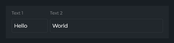
- id: row-1
  type: row
  fields:
    - id: text-1
      type: input
      attributes:
        label: Text 1
        value: 'Hello'
        colSpan: 1
    - id: text-2
      type: input
      attributes:
        label: 'Text 2'
        value: 'World'
        colSpan: 3
The field does not store any values.
Search Field
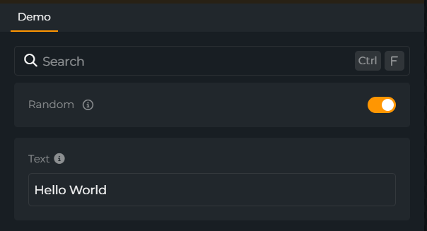
The search field can be used to group any number of other fields and search through them and all of their ancestors. Searched ancestor fields: label, description, title, value
  - type: search
    id: my-search
    fields:
      - type: boolean
        id: random
        attributes:
          label: Random
          description: This is a description
          value: true
      - type: input
        id: text
        attributes:
          label: Text
          description: This is a description
          value: Hello World
          type: text
      - ...
The field does not store any values.
Tabs Field

The tabs field provides a tab bar with defined tabs to structure and group other fields. Recommended to be used as the top level field. The optional templates field in a tab specified the pre-selected tab when the user selects templates in the configuration menu.
  - type: tabs
    id: my-tabs
    tabs:
      - label: Tab1
        fields:
          - type: boolean
            id: random
            attributes:
              label: Random
              description: This is a description
              value: true
          - ...
      - label: Tab2
        templates: true
        fields:
          - type: input
            id: text
            attributes:
              label: Text
              description: This is a description
              value: Hello World
              type: text
          - ...
Conditional Fields
Tips
Conditional fields require additional review and may delay the review process. Please use them only when necessary and avoid using them for complex logic since they will decrease the performance of the form.
Conditional fields allow you to show or hide fields based on the value of another field. Conditional fields are defined using the if attribute. The if attribute must be a valid JavaScript expression that returns a boolean value, and it can be used either for the field itself or for values in the options array. As of now, only values are available in the context.
The following example shows how to use conditional fields in multiple ways:
  - id: theme
    type: dropdown
    options:
      - label: Default
        value: default
      - label: Legacy
        value: legacy
      - label: Bubbles
        value: bubbles
      - label: Zwietracht
        value: discord
    attributes:
      label: Theme
      value: default
  - id: options
    type: checkbox
    options:
      - label: Test Mode
        value: test-mode
      - if: "['default', 'legacy'].includes(values.theme)"
        label: Show Badges
        value: show-badges
        checked: true
      - if: "['default', 'legacy'].includes(values.theme)"
        label: Show Avatars
        value: show-avatars
      - label: Hide Old Messages
        value: hide-old-messages
      - label: Hide Commands
        value: hide-commands
    attributes:
      label: Options
  - id: message-timeout
    if: values.options.includes('hide-old-messages')
    type: input
    attributes:
      type: number
      label: Message Cleanup
      value: 30
      description: The number of seconds to cleanup
Receiving Values
Using the API
The values are received using the TBD endpoint. The following example shows how data is represented in the API:
{
  "values": {
    "resource": "1337",
    "text": "Hello World",
    "dropdown": 2,
    "checkbox": [
      "code-of-conduct"
    ],
    "font-settings": {
      "font-family": "Impact",
      "font-style": "bold",
      "font-size": 14
    },
    "ignored-users": [
      "user1",
      "user2"
    ],
    "image": {
      "id": "98f9fd85-0832-44fa-87d1-e24d9741f632",
      "type": "file"
    }
  }
}
Using the Extension SDK
The values are consumed using the modular SDK via the useContext module (recommended). This provides strongly-typed access to the context and value diffs without relying on the deprecated namespaced API.
import {initializeExtension} from '@own3d/sdk/extension'
import {useContext} from '@own3d/sdk/context'

const extension = initializeExtension()
const {onContext} = useContext(extension)

onContext((context, changed) => {
    // context.values contains the current form values
    // changed is an array of keys that changed in this update
    console.log('changed keys', changed)
    console.log('form values', context.values)
}, {immediate: true})
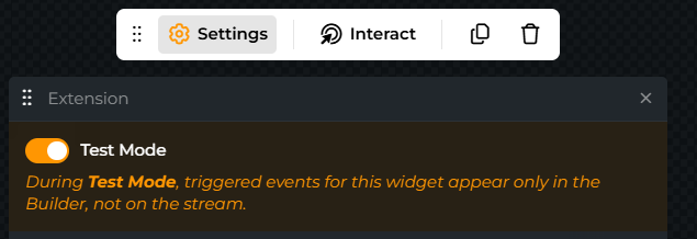
Demo-Mode
Add has_demo_mode: true to the manifest.yaml (feature flag still lives in the manifest; the form itself is in forms.yaml). This will add a "Demo-Mode"-Box to the Settings in the Scene-Builder.
# manifest.yaml
id: 98f9fab0-0714-46d8-ac77-d57130a1dc88
has_demo_mode: true
# forms.yaml
schema_version: 1
id: 98f9fab0-0714-46d8-ac77-d57130a1dc88
inputs:
  [ ... ]
Listening for demo mode changes with the modular SDK:
import {initializeExtension} from '@own3d/sdk/extension'
import {useContext} from '@own3d/sdk/context'

const extension = initializeExtension()
const {onContext} = useContext(extension)

onContext((context, changed) => {
    if (changed.includes('demo_mode')) {
        console.log('demo mode toggled =>', context.demo_mode)
    }
})